Services List
As you browse and maneuver around the internet, you visit landing pages all the time.
A landing page can be the designated page you’re taken to when you click on an ad. It can also be the page that follows a call-to-action button or serve as the homepage of a website.
Regardless of how you "land" on a landing page, its purpose is to encourage you to convert to a lead or customer. For that reason, landing pages are uniquely powerful components of a business's digital marketing strategy.
What Is A Landing Page?
A landing page is a website page with a specific purpose — the objective of a landing page is to convert visitors into leads. While there are many types of landing pages the intent the same — get more leads.
Landing pages contain lead forms that ask visitors for their contact information in exchange for something of value, otherwise known as an offer.
A targeted, well-crafted landing page with a solid format and sound copy will get almost anyone to submit their information.
Why A Landing Page Is Important
Why would you create a special page just for people to fill out a form? Why not just use your homepage or about page? Great questions.
After reading this article, you’ll likely be able to answer those questions yourself, but the short answer is this: A landing page eliminates distractions by removing navigation, competing links, and alternate options so you capture your visitor’s undivided attention. And complete attention means you can guide your visitor where you’d like them to go, i.e., to your lead form. In sum, landing pages are specifically designed to create conversions.
Now that you understand their importance, let’s cover landing page best practices to make sure your pages are set up to convert.
- Craft a benefit-focused headline.
- Choose an image that illustrates the offer.
- Write compelling copy.
- Include the lead form above the fold.
- Add a clear and standout call-to-action.
- Give away a relevant offer.
- Only ask for what you need.
- Remove all navigation.
- Make your page responsive.
- Optimize for search.
- Remember to use a thank you page.
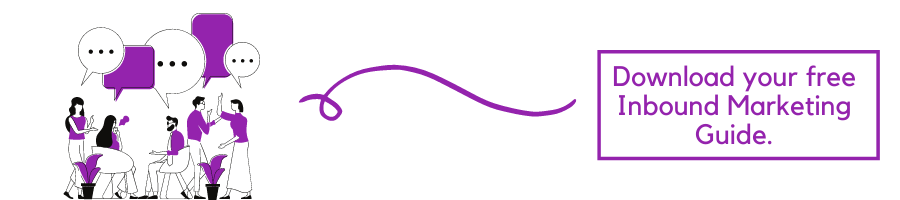
Let's Build You A Landing Page
Often times, design means creativity, colours, and pretty pictures. For the purpose of a landing page, we take design a step further to mean functional, direction-oriented, and effective. So, to craft a well-designed landing page, you’ll have to tap into both your right and left brain. But don’t get me wrong — you still need great imagery and attractive colours to convert your visitors. We’ll touch on how to incorporate all of this below.
Structure
The good news is you don’t need to get too creative here. Most landing pages follow a very similar structure because it’s been proven to work. You can infuse your creativity through branded elements and images, but stick to a landing page format that people are used to seeing.
A good landing page has five elements (check out the landing page example below to see these elements in practice):
- Headline that grabs the visitors attention
- Relevant image that is relevant to your audience
- Lead form that sits above the fold to capture visitors’ information
- CTA that is action-oriented and compelling
- Copy and description that informs and entices your visitor to complete your form
Heed! A Call-to-Action (CTA) Is Important
We’ve discussed your CTA a few times so far, but since it’s the most important part of your landing page, it’s worth mentioning again. When it comes to the design of your CTA, there are a few tricks will make it so alluring that visitors feel compelled to click. To clarify, your CTA includes the button and the copy you use to draw attention to it; these tips cover both.
- Give your CTA a vibrant and contrasting color
- Focus your CTA copy on the benefit to your visitor
- Get to the point — try using no more than five words
- Tell your visitor what you want them to do using action verbs, e.g. Get, Download, Click
- Make your button large enough to stand out on the page
- Give it some negative space — don’t crowd the area around your CTA
- Follow the flow of the page and place your CTA where your readers’ eyes will go, such as to the right of or below the copy
- Test your button shape, test your copy … as a matter of fact test everything (we’ll cover how to do this below)

Landing Page & Tricks From The Pros (that's us!)
There are always tweaks you can make to boost landing page performance. Below are a few great tips to get your landing pages leveled up.
Optimise, Optimise, Optimise!
Optimise is such a confusing word, isn’t it? I mean, are we talking about imagery, copy, keywords, or UI? The answer is yes — we’re talking about all of it. Optimise just means to make your landing page the best it can be, and that can include a myriad of modifications. If you want to know everything you could do to optimise your landing page, you’ll need a pretty expansive guide. And, guess what, we have one here.
Make Them An Offer They Can't Refuse
You could argue that anything free qualifies as “good,” but that isn’t exactly true. Not only should your offer be free (we’re not talking sales pages here) but it also has to be good enough to warrant a stranger giving you their personal information. Let’s face it — there are a lot of companies competing for your audience’s attention, asking for their information and soliciting them via email. So, what’s going to make you stand out from the pack? An outstanding offer, that’s what.
Here are a few questions to determine if you have a compelling offer or not:
- Does my offer solve a pain point for my target audience?
- Is there a clear benefit that a lead can gain from this offer?
- Can my offer rival the competition?
Shesha Page Load Time!
A single second delay in page load time means 7% fewer conversions and 11% fewer page views. Slow page load times can also result in customer dissatisfaction and frustration.
Needless to say, landing page load time is a metric to take seriously. If you need some tips, check out this resource on decreasing page load time.
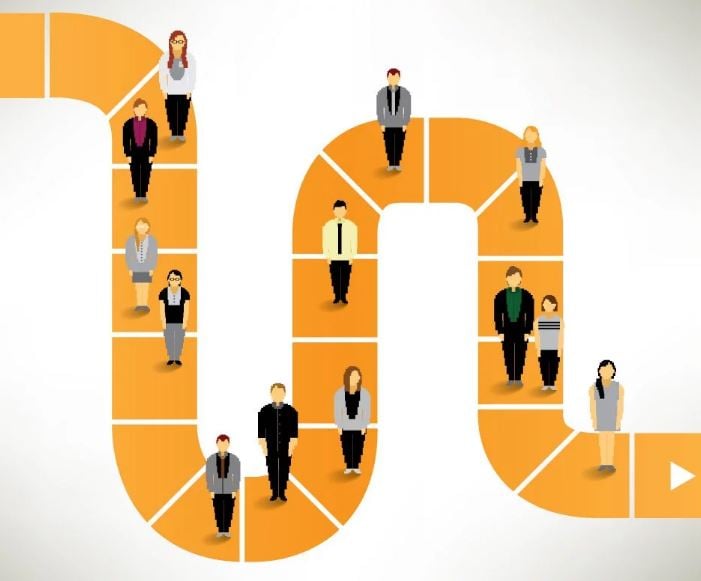
Your Buyer's Journey Should Be Top Of Mind
Since you’re driving traffic to your landing page, you should have a clear idea of where your visitors are in their buyer’s journey. That means you’ll know if they’re trying to diagnose a problem (awareness), looking for a solution to their problem (consideration), or are ready to close (decision). Your copy and offer should reflect this if you want to convert. It’s no different from any other marketing materials — meet your visitors where they are.
Flow, Like Water
No one should be surprised when they arrive on your landing page. It should be exactly as advertised, meaning be consistent with your copy. Use the same words on your landing page that you used to get people to arrive there, whether it was a paid ad, social post, blog CTA, or email. You need to avoid the bait and switch at all costs if you want people to stick around.
Make It Easy For Conversion
There should be no guesswork involved in navigating your landing page. Once someone arrives on your page, it should be clear what you want them to do — submit their info to your lead form. Your goal is to guide visitors to your form using creative directional cues.
Here are some ways to point your visitor to a conversion:
- Choose an image of a person that is either gazing in the direction of or pointing to your form
- Make your CTA a contrasting colour to draw attention to it
- Use arrows that point to your lead form
- Insert anchor text that brings people back to the form when clicked
- Give your CTA some negative space on the page
- Frame your lead form with a bold color or outline
Play With FOMO (Fear Of Missing Out)
Few emotional marketing tactics work as well as fear … and the fear of missing out (more formally known as FOMO). Consumers don’t like to lose their ability to choose, and once you make it clear that your offer is in high demand and/or short supply, they’re going to clamber to get it. (Here’s a cool study on cookie jars if you want to geek out on the psychology of scarcity marketing.)
The other reason why this technique works is because people want things that are hard to obtain — that signifies value and exclusivity.
To show scarcity, mention how little of your offer is left, include a countdown timer, use words like “ends soon” or “last chance”. Obviously, we want you to be genuine, so only employ tactics that are true for your business.
Conclusion
There are many ways to use and benefit from this technique, so make sure that you make use of landing pages. At Velocity Media we have created a landing page for each of our company offerings, such as email, mobile marketing and content creation. These have come in handy and were all worth the effort.
-Jan-22-2024-11-01-03-2731-AM.png?width=1200&name=CRM%20System%20(1)-Jan-22-2024-11-01-03-2731-AM.png)
Quick Lists
Services List
Subscribe
The Psychology Behind Conversions
Explore the psychology of CRO in our FREE e-book to boost conversions and profits by understanding customer behaviour and decision-making factors.